A Design Language project to design the new range of portable products dedicated to retail distribution, for Olimpia Splendid.
Customer: Olimpia Splendid


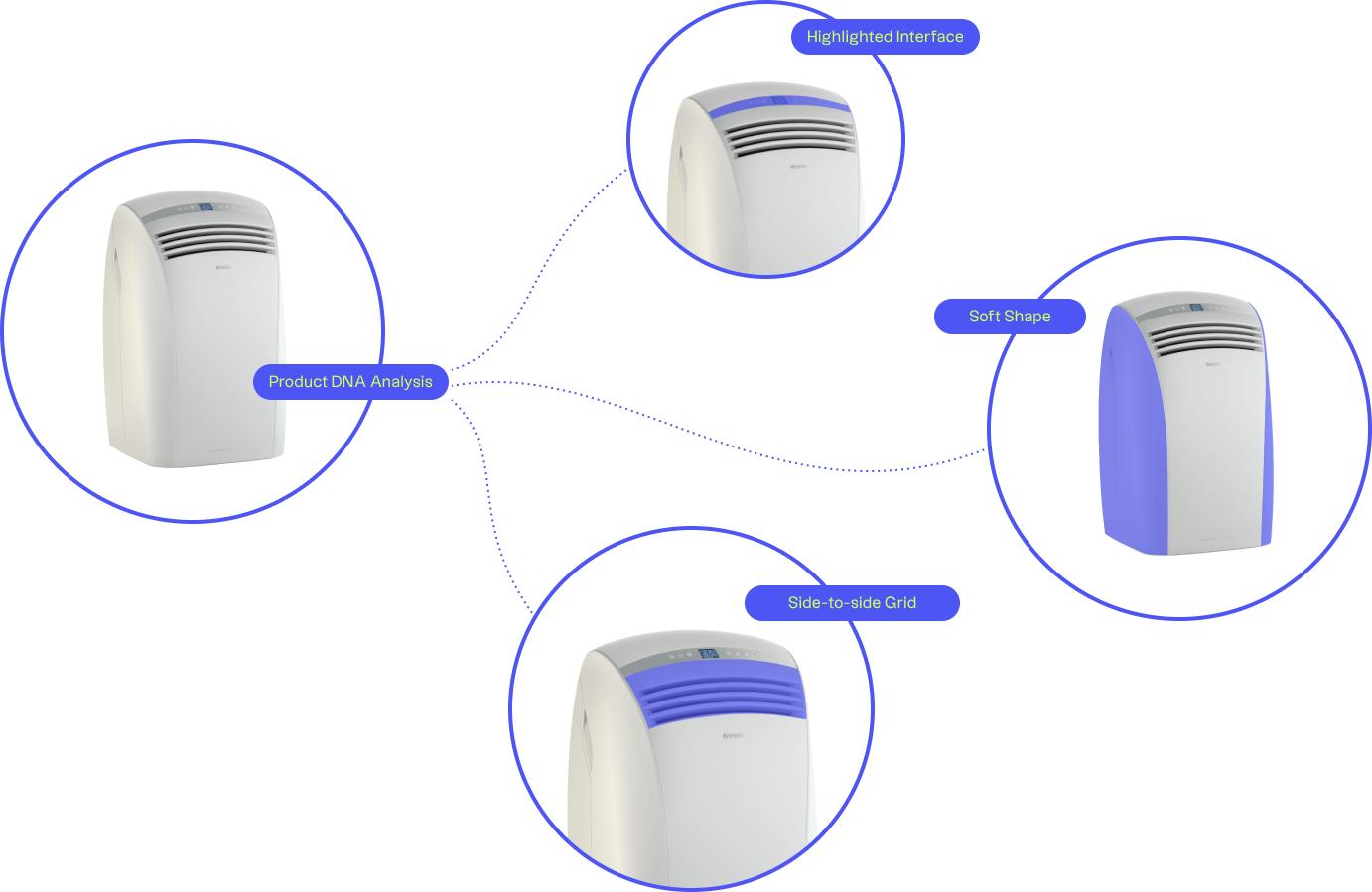
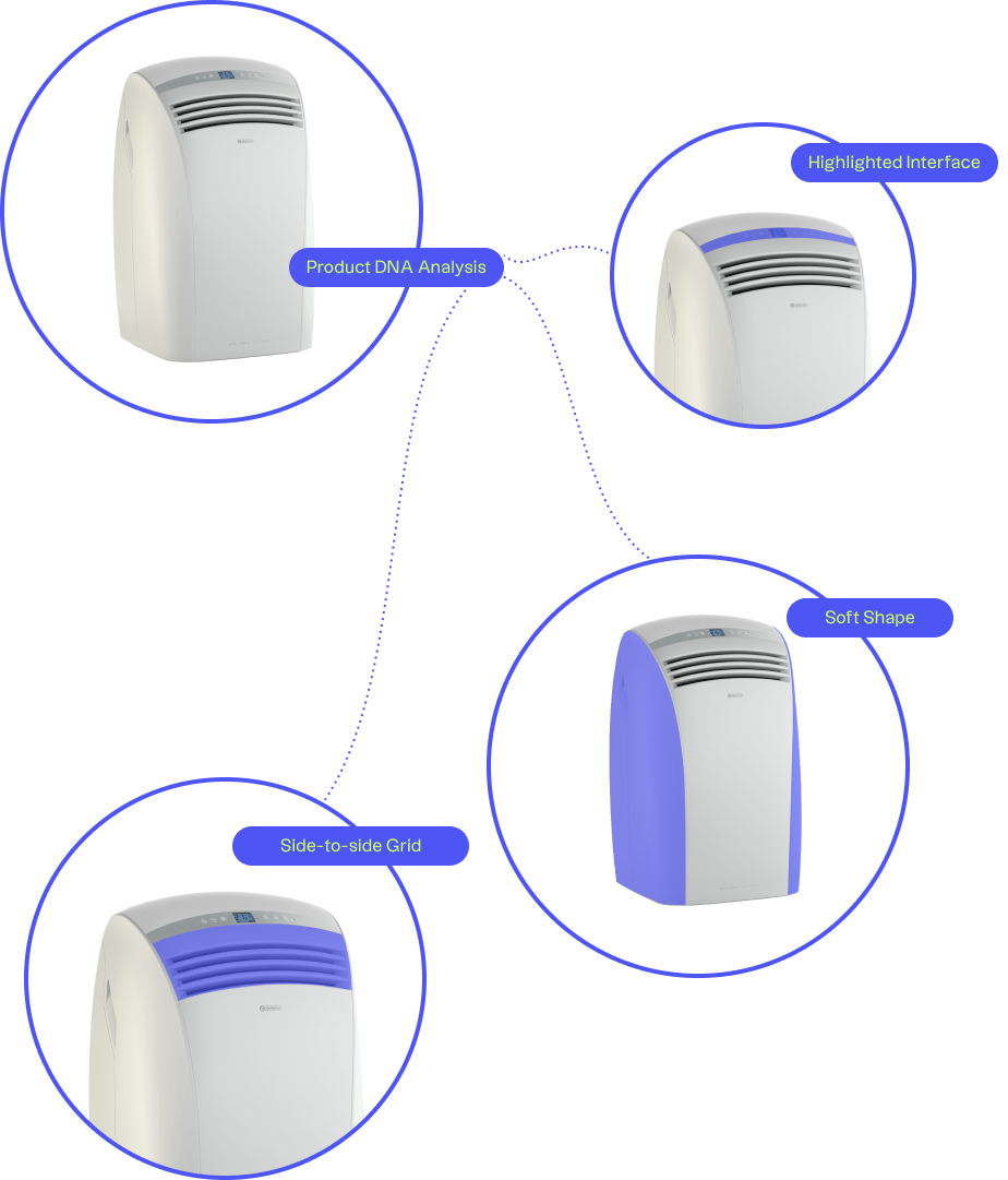
The challenge of this project was to identify the distinctive features of Olimpia Splendid's historic product — the Dolceclima — and to apply them to all the products.
The goal was to consolidate brand recognition and spread a new range language applicable to all portable products, so as to make Olimpia Splendid emerge in large retailers

To facilitate the exchange of information between the various departments involved, we have organized moments of sharing and working with the entire project team. The values to be communicated through the product were identified with the support of moodboard and possible stylistic solutions were explored during the sketch phase.
In the final phase of the project, we refined the different design directions chosen and studied the construction details, using renderings that helped the entire project team to choose the best solutions to be applied to the different products.
The technological part is treated with contrasting finishes and is ideally embedded in the upper part of the product. The distinctive element is the front shield that houses the logo and is emphasized by a controlled line that interrupts the soft features, creating a surface discontinuity characterized by variable color and finish.
During the development of the project, different levels of complexity were considered to propose a correct product design. We have considered market logic and user requests, meaning as a user not only the end customer, but also the buyer, for example, who is faced with strong competition from online channels.
This analysis has led to the definition of new flexible product architectures, capable of adapting to a series of customizations at multiple levels, from simple CMF to body differentiations based on:
— geographical area for each product that is sold in Europe, the United States and Australia and must meet local usage expectations
— requests from buyers who increasingly want to have a different product and offer a unique product compared to their competitors

The work done on the first two products in the range was appreciated by the domestic market and allowed the company to surpass its most direct competitors.
In addition, Dolceclima Pro in 2019 and Aquaria S1 in 2021 won the Good Design Award, a prestigious award established in Chicago in 1950.
